Case Study 01 · Ticket Attendant
Concourse: reimagining a complex ticket consignment platform.
Brokers called it slow, cumbersome and outdated. We rebuilt it mobile-first, brought it to desktop — and then discovered that the same users wanted the exact opposite thing on a bigger screen.
Role
UX Designer
Team
2 UX designers, 2 developers
Product
SaaS ticket consignment
Users
Professional ticket brokers
Platform
Mobile + Desktop
Timeframe
Two years
Overview
A powerful tool with a difficult user experience.
Ticket Attendant builds the consignment platform ticket brokers use to manage inventory across the entire life cycle of a ticket — importing, pricing, broadcasting listings, delivering orders, analysing the results.
The existing platform did all of that. It was also difficult to use, with notoriously long load times — up to thirty seconds. Clients found the interface outdated and confusing, and the reliability problems quietly undermined their confidence in the data itself.
We rebuilt the experience from the ground up: Concourse on mobile first, then a desktop version. The goal was a faster, more intuitive product that kept every bit of the data depth this audience depends on.
The Challenge
Three problems, named by the users themselves.
- Slow performance. Screens took twelve seconds or more to load, occasionally reaching thirty.
- Poor usability. Navigation was difficult, and users complained about the experience consistently.
- Lack of reliability. Inconsistent behaviour made people question whether the data was accurate and whether the platform could be trusted at all.
Underneath the usability problem sat a business one: how do you modernise a complex SaaS product — improving the experience — while preserving the information depth customers depend on? Clients were leaving because of friction. Solving it would keep the ones we had and win the ones we didn't.
I wanna know: what's my take-home pay? And how do I know if it's a good buy?
Ticket Attendant superuser
Understanding the Users
Mapping the ticket lifecycle.
We interviewed stakeholders, clients and operations staff, and mapped the whole lifecycle of a ticket:
01
Import — automatic or manual
02
Pricing
03
Broadcasting
04
Sale
05
Order delivery
06
Reporting
That showed us not just which features people used, but when, why, and what information they needed at each stage.
The research revealed something that changed the brief. Ticket Attendant users are intensely data-driven — working across multiple monitors with spreadsheets, stadium maps and analytics tools open at once. They are not asking for a simpler product in the traditional sense. They want any and all of the information they need to make better decisions, and they want to reach it quickly.
The questions they asked us, over and over:
- Is this inventory worth buying?
- What is the most competitive price?
- What is likely to sell — and how did it sell last time?
- Which way is the market moving?
- How do I respond faster than my competitors?
- What is happening across my whole inventory?
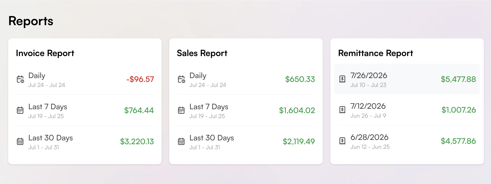
- What sold today, and what is my take-home pay?
The goal wasn't to remove complexity. It was to make complexity easier to navigate.
Defining the Opportunity
Balancing three perspectives.
Business
Ticket Attendant needed to attract and retain clients with a product that felt modern, reliable and worth paying for.
Technology
The platform had to handle large volumes far more efficiently. Engineering explored pagination, lazy loading and server optimisation.
User Experience
Working out what information people actually needed at each stage — and designing the most efficient way to reach it.
The Design Challenge
How might we increase trust and adoption among ticket brokers by creating a faster, more intuitive and modern platform experience — one that communicates reliability and makes complex ticketing data easier to navigate?
Designing Concourse
Start small. Think big.
Prioritise
A prioritisation matrix weighed user impact, business value, technical feasibility, effort and performance. It stopped us redesigning everything at once, and gave the whole team a shared framework for saying no.
Go mobile first
Not because of screen size — as a strategy for managing complexity. A small screen forces the essential question: what does the user actually need right now? If we couldn't make a workflow understandable on a phone, the workflow itself needed questioning.
Condense
We studied which screens duplicated information, combined similar features, and shipped strong defaults with customisation behind them. The first MVP covered the two workflows brokers most needed away from their desks: pricing and broadcasting.
Measure adoption, not completion
Rather than wait for the project to finish, we tracked daily logins per user and unique logins across the legacy platform, the old mobile app and the new one. New-app logins drastically outran the old app — enough to sunset the legacy mobile product.
From Mobile to Desktop
What worked on mobile did not work on desktop.
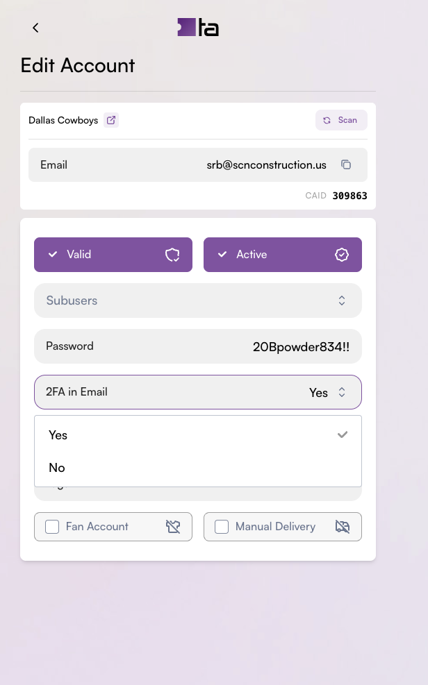
We expected the streamlined mobile approach to translate naturally to the bigger screen. The users disagreed. The simplicity they had appreciated on a phone felt restrictive on a desktop.
That taught us something worth more than the feature it produced: responsive design isn't about making the same interface fit different screen sizes. Context matters enormously. On mobile, brokers needed speed and focus. On desktop, they wanted visibility and comparison — their old spreadsheets back in view, more inventory, more attributes, more information at once so they could spot an opportunity and move.
So we built a comprehensive grid view, showing far more at a glance. It turned out to be the single critical adoption barrier. After it shipped, adoption jumped to seventy per cent.
They liked the new look a lot, and some of our design choices they really enjoyed — but it was really about seeing the data all in one place instead of hiding it that made the difference.
For this audience, more information wasn't the problem. Unorganised information was.
The Design Insight
Complexity can be a feature.
One of the biggest lessons of this project was that the conventional UX instinct to simplify isn't always the right answer.
Ticket brokers are sophisticated, highly data-driven users. They use information to spot opportunities, assess risk, price inventory and get ahead of competitors. They don't necessarily want a product that hides complexity. They want a product that makes them feel capable of handling it.
The job wasn't reducing power. It was making that power easier to reach: hierarchy without deleting information, efficient workflows, and the level of detail appropriate to the context someone is working in. Action menus were streamlined to offer the right actions at the right moment, instead of the same long list on every page.
Outcome
A new foundation for Ticket Attendant.
What the team did
- Created a mobile-first product foundation
- Prioritised high-value workflows over breadth
- Simplified complex mobile workflows
- Used adoption data to steer what came next
- Worked with engineering on strategies for handling large data volumes efficiently
- Adapted the desktop experience on customer feedback
- Introduced a comprehensive grid for data-heavy desktop work
The arc, in short
- Pain points: slow, cumbersome, outdated.
- First strategy: combine pages, better defaults, a reliable back end.
- Result: noticeably faster — and over-simplified.
- Revision: compress the view to satisfy both stakeholders and users.
- Landing: 90% adoption of the new platform, then production, feedback and KPI measurement driving continuous improvement.
Reflection
What I learned
This project changed how I think about complexity in UX. It's common to equate good UX with minimalism — fewer screens, fewer fields, less information, reduced cognitive load. The Ticket Attendant work showed me that the right amount of complexity and data depends on the user and the context.
The same person wanted a streamlined experience on their phone and significantly more information on their desktop. Neither version was simpler or better. The difference was what they were trying to accomplish.
It also reinforced three habits I'll carry into the next thing I build: design around real workflows, validate assumptions with the people who live in them, and treat constraints as design problems rather than something to consider after the design is done.
Next case study