
Logo and Branding Redesign for TA
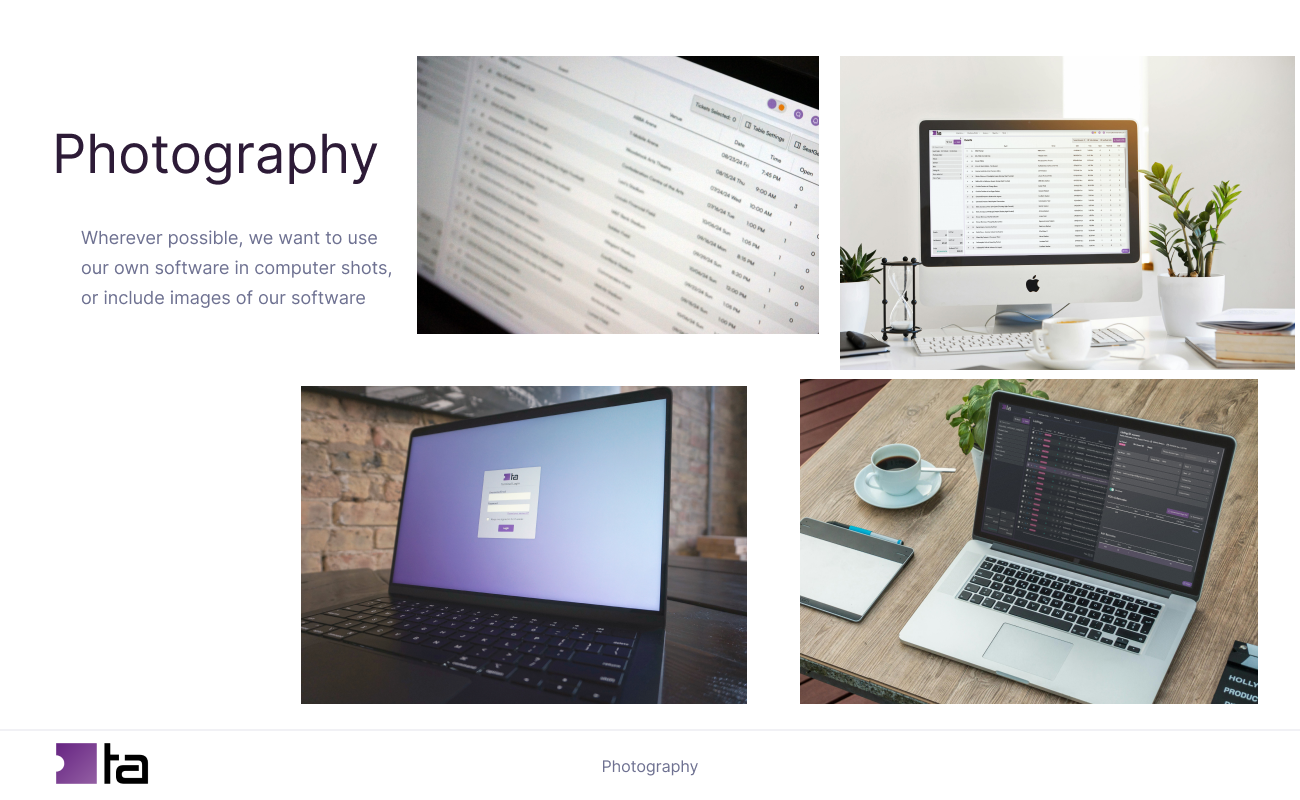
Upon being hired at Ticket Attendant, the first project we worked on was branding. The senior designer and I came up with a new logo and company branding to replace the old, outdated logo and elevate the company image.
Logo Redesign

Old Ticket Attendant Logo
Flight attendant and tickets. This logo had almost 10 different colors. It was hard to scale because details became obscured when it was very small, and the styles of illustrations were not harmonious.

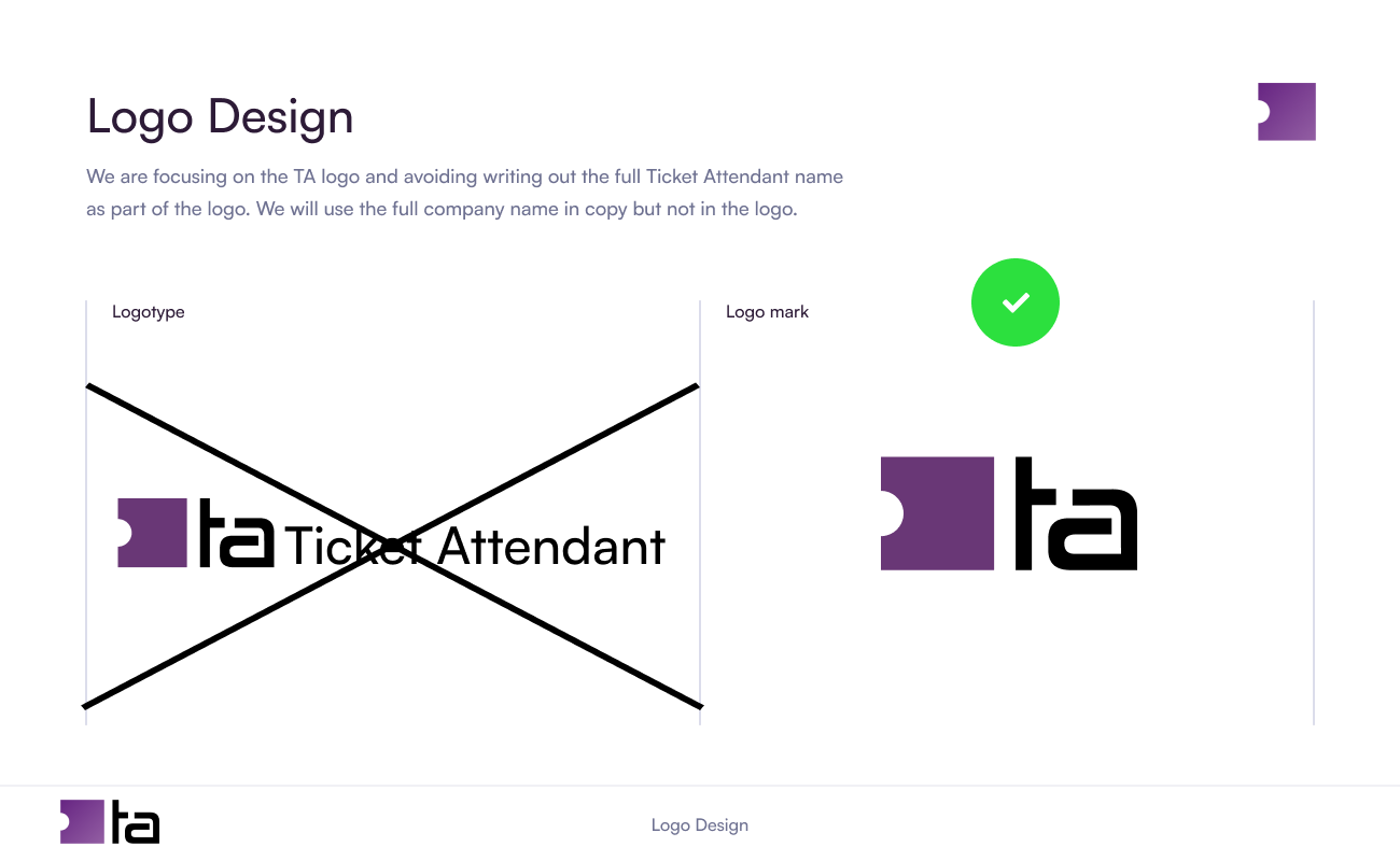
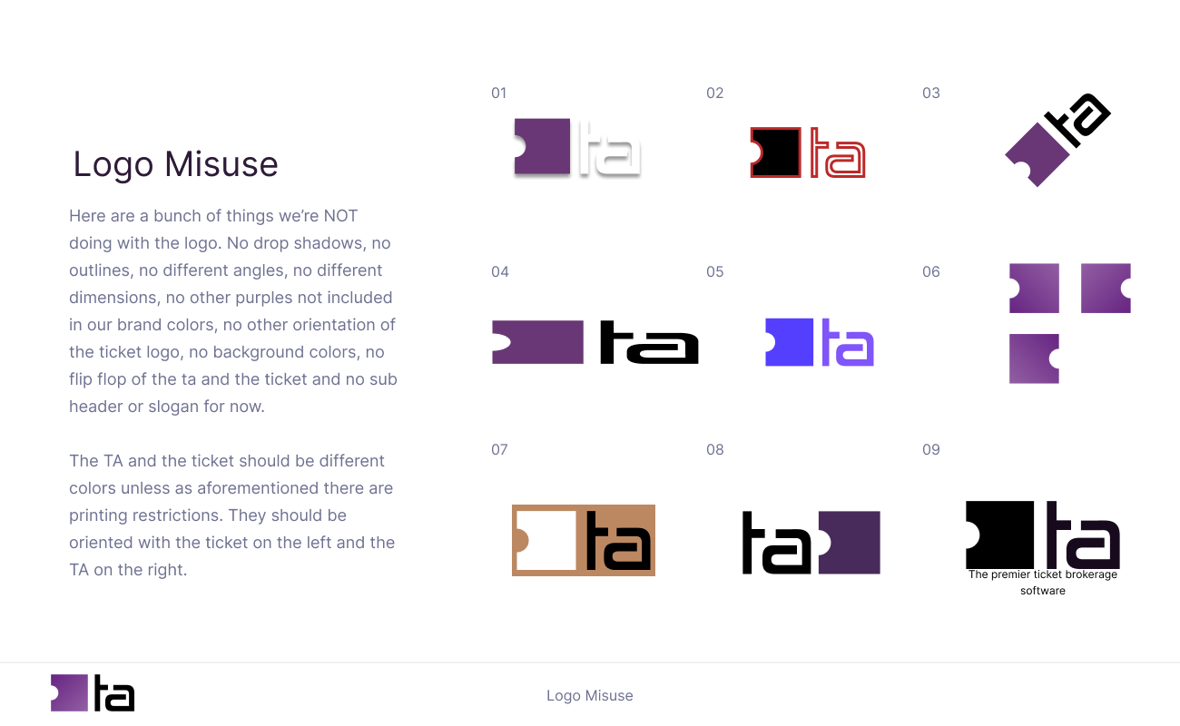
Ticket shape and initials.New Ticket Attendant Logo
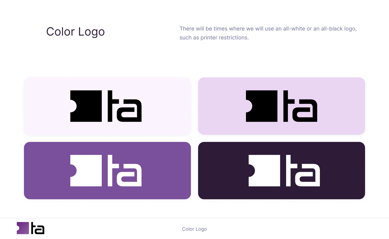
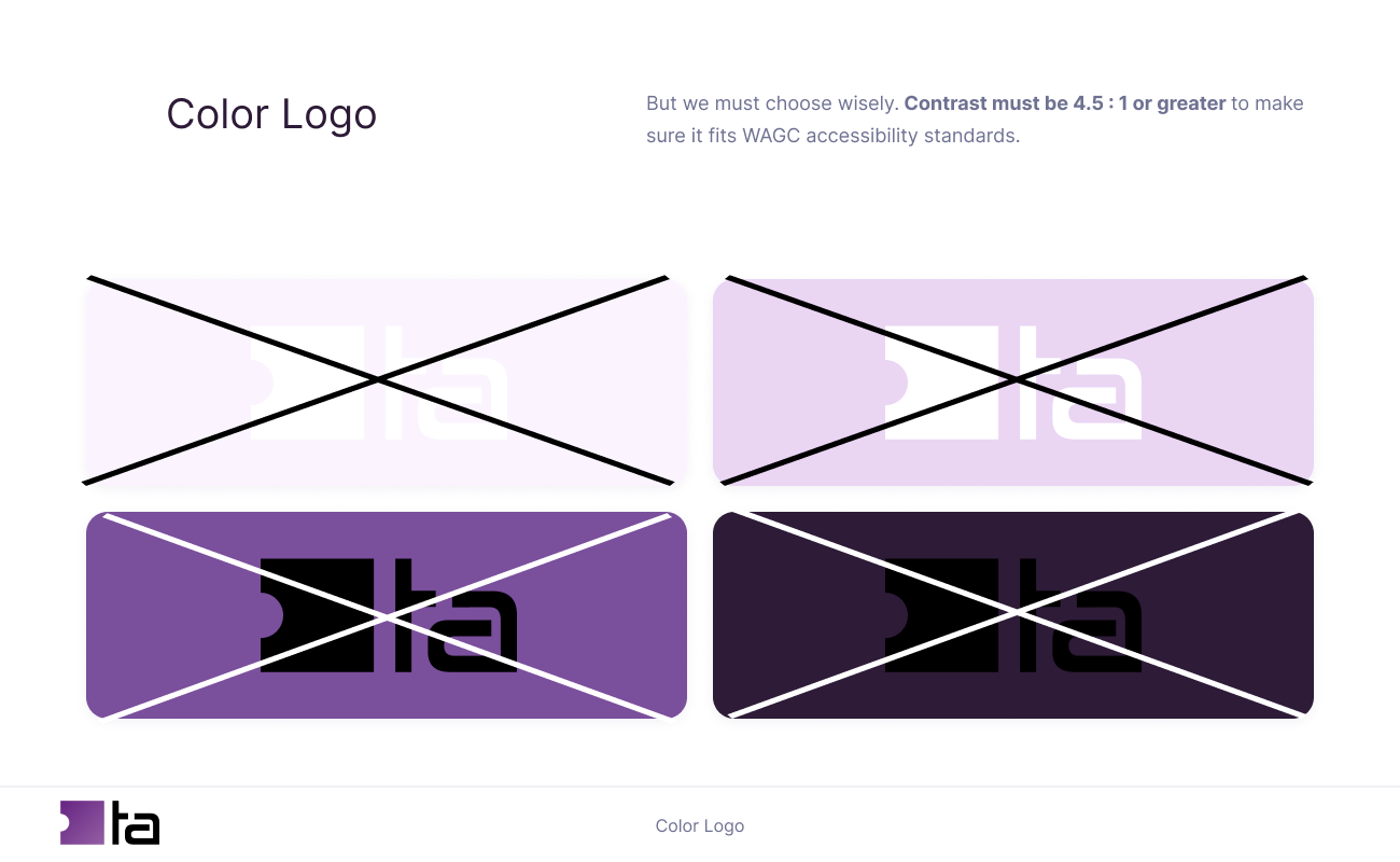
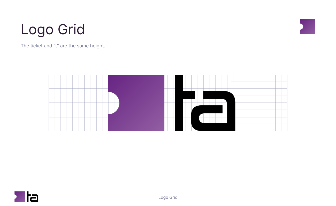
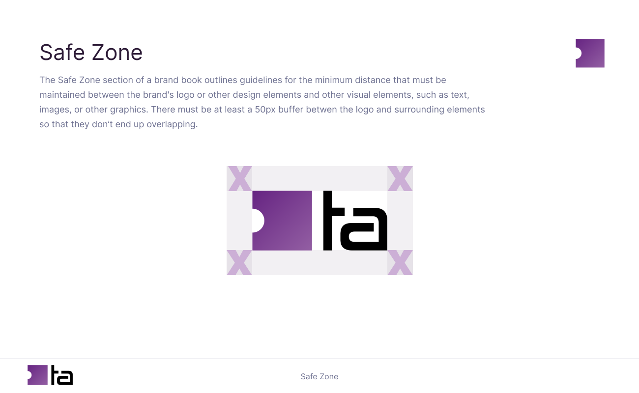
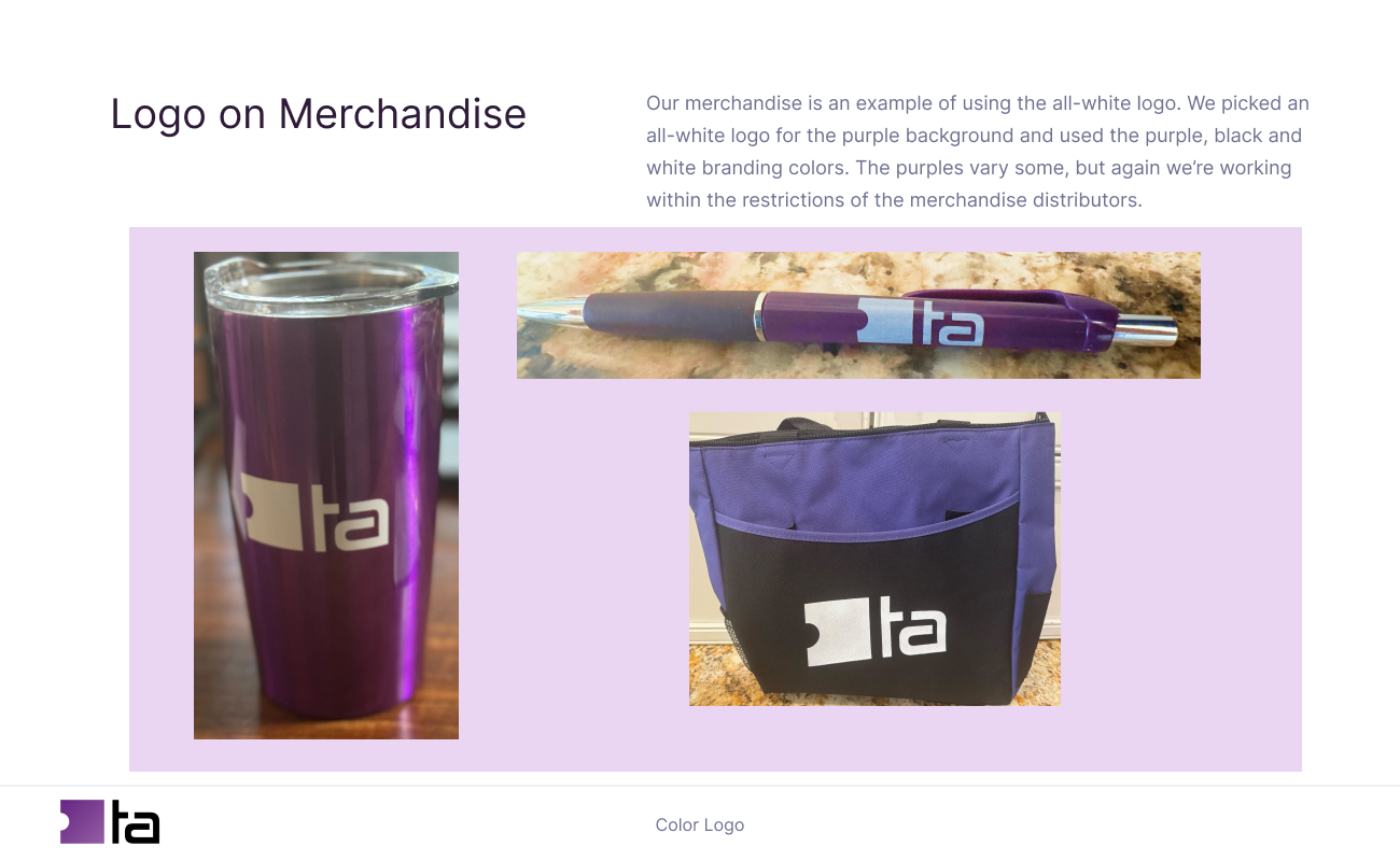
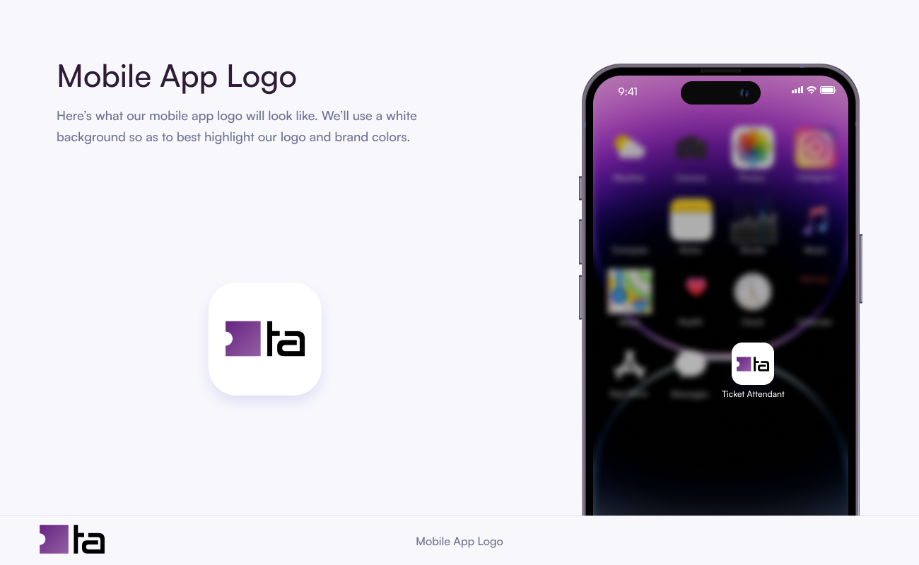
This logo has only 2 colors, scales very well and can be represented by just the ticket shape for a favicon. The style of image and letters are harmonious.
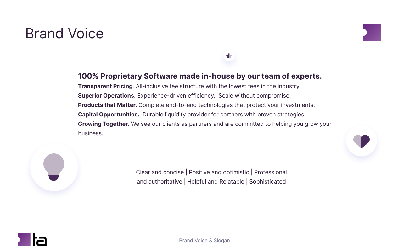
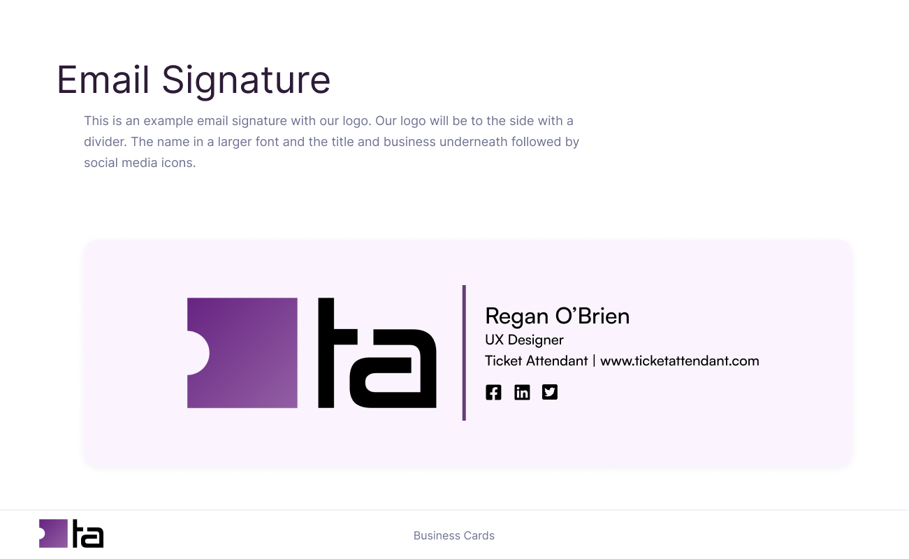

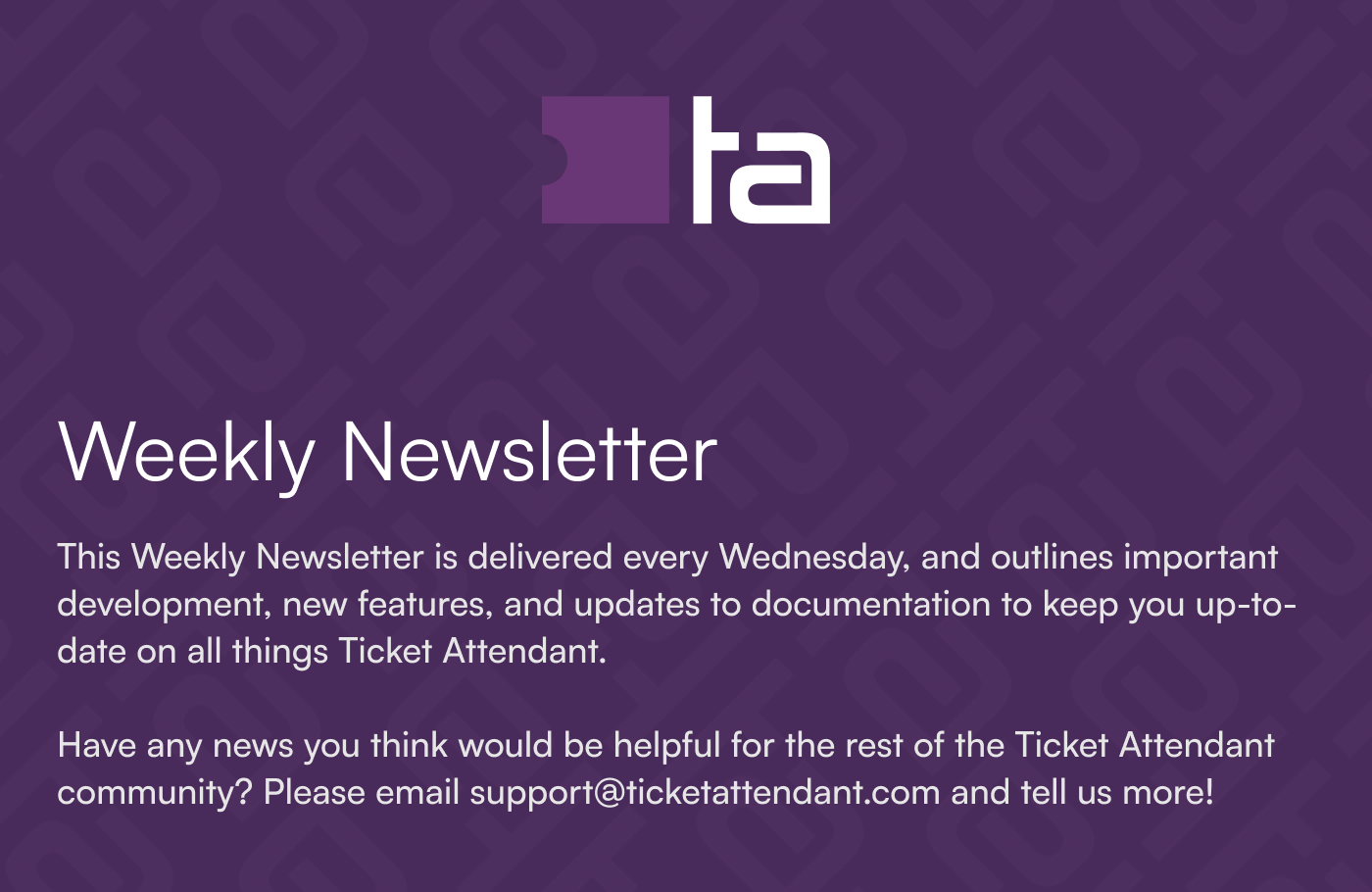
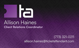
With the “TA”, I made this background pattern for general company use.
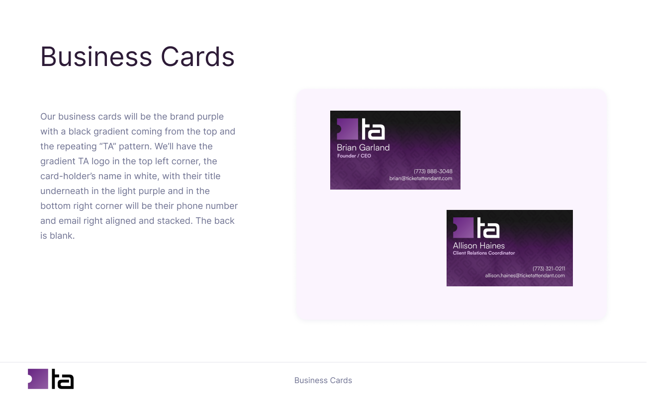
We put it on our business cards, newsletter, brochures, and website to add branded texture.

Make it stand out.
It all begins with an idea. Maybe you want to launch a business. Maybe you want to turn a hobby into something more. Or maybe you have a creative project to share with the world. Whatever it is, the way you tell your story online can make all the difference.